Tidal Design System
WorkWave recently added their 9th product, bringing in an ERP (Enterprise Resource Planning) software designed specifically for field service industry. This tipped the scales in needing a unified design, we were getting further and further from looking like a single company, with any resemblance of brand identity. A unified design system had been in the talks since I had been hired, but we finally received the go-ahead to start working on a long overdue set of standards.
Role
Product
Platform(s)
Areas
Contributor
WorkWave Design System
Web & Mobile
Component creation, UI/UX
Background
Tidal is the collaborative work of 15 designers, a dozen engineers, a lot of borrowing from MUI and Material, and countless meetings with breakout teams trying to advance our design system one component at a time. We listed all the components that we’d need on our first pass, and on volunteer basis asked people to form taskforces. The result was teams of 2-5 people working on a single component on their own schedule, which worked surprisingly well. I had a few projects with specific components that I was in need of, so I signed up for those first. Once the taskforces had completed the components, it was adding the documentation to our ZeroHeight page. Below is a preview of just a few components I was part of a task force on.
Color Palette
The Tidal color system helps us apply color to our user interfaces meaningfully and consistently across the WorkWave product portfolio. Our color system was designed to:
Reflect the WorkWave brand
Be harmonious
Support AA WCAG accessibility guidelines
Provide additional context to our users
Suggest content hierarchy and interaction priority
Distinguish UI elements and surfaces from one another
The Tidal palette consists of twelve color families (including grays), with multiple tints and shades within each. This is a total of 139 colors, however I am just showing a handful of the color families to show them off.


Radio Buttons
The Radio Button (also known as an option button) is an element used when users need to make a choice between two or more mutually exclusive, related options. I was using Radio Buttons for the payment portal, and decided to help out with this task force. The most difficult task here was creating the component in Figma, with sets of variant properties a user can pick making each radio button fully customizable.


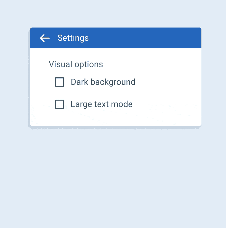
Checkboxes
Checkboxes allow users to select one or more items from a set, or they can turn an option on or off. There’s not much too a checkbox at first glance, but that’s how I felt about all of the elements I worked on, until we got into the nitty gritty. We break down each component in our design system into 5 sections. Usage, Principles, Anatomy, Behavior, and States. As to not bore you, I imagine you know about the usage, principles (familiar, scannable, efficient), and anatomy (container & icon) of a checkbox, but here are some of the behaviors I worked on. I created these gifs to add some excitement to the Zeroheight documentation of our design system. I didn’t want too much excitement, it wouldn’t be fair to the other contributors.

Selecting multiple items in a list using checkboxes
Turning an item on and off using a checkbox

Checked, unchecked, and intermediate states of a parent checkbox
The last section is the various states, including selected, unselected or indeterminate. On top of that, they can be enabled, disabled, hovered, or in a focus state. I also included various color choices using our Tidal color palette, this can be for primary, default, secondary, error, warning, info, and success. To cap things off, here’s a snapshot of just how much information went into making a design component for checkboxes.

In conclusion…
This was truly a team effort, and it seemed that whenever someone had a lull in the design work coming in, they’d fill that time with chipping away at the vast number of design components. Since initially making this page, I have been involved in alerts, snack bars, and toasts, as well as the color palette as our WinTeam modernization is effecting some of the secondary colors. This will be a long process, but it’s already proven to be incredibly helpful.
More Projects


WinTeam Modernization
TEAM Software
Payment Portal
TEAM Software
Mobile Designs
TEAM Software