Payment Portal
Our customers using TEAM Software currently pay invoices through a third party portal, that only accepts credit card. The task was to create a new internal payment portal, allowing ACH & credit card payments, and designing it using our new design system while marrying the existing flow for a positive user experience
Role
Product
Platform(s)
Areas
Design Lead
TEAM Software/Winteam
Web
Research, Design, User Testing
Background
TEAM Software is the world’s leading software for security, cleaning, and facilities management companies. With over 6 million transactions a day, and over $120 Billion of revenue among customers, we needed to stay modern and give our users a positive experience at all corners of using our program, including paying their invoices. It would become increasingly clear that our competitors are modernizing, and we were lagging behind. In a nutshell, I was tasked with designing a new payment portal for customers to pay their invoices, using our existing software. As I already know the product well, this process started with the research phase into how payments should be accepted for both ACH and credit card.

Competitive Analysis of other companies payment methods
Research
The research kicked off with reviewing the scope document created by the Senior Product Manager. In there, she laid out exactly what we were going to achieve, and a checklist of must-have items, as well as some nice-to-haves. With this document open on one monitor, I got to work researching how ACH and credit card payments are made on other sites, particularly sites that we’ve all interacted with, as they have a method behind their design. In looking at heavily trafficked sites like Amazon & PayPal, to less design focused sites such as my Electric & Gas company, the YMCA, and others, I was able to create a rough research board in Figma. There were many details about making a payment that go almost unnoticed, from the use of breadcrumbs to give the user a perspective on where they are in the checkout, to the fields required to complete a payment, and how they’re laid out. Kiewit Luminarium has the entire credit card field on one line, is that better than segmenting it out into 3 fields for the card number, expiration, and CVC? These were only a sample of notes created from this stage of researching the competetive landscape. Next came looking into the ‘why’, and I referenced the Nielsen Norman group for their take.

I often refer to the Nielsen Norman Group as one of my past mentors would often send me links to their documentation when I would ask questions. I quickly caught on that he wanted me to research myself instead of just slack him messages, which I appreciated and it has made me better at creating initial concepts. It was still early on in the process to be deciding form layout, but my research led my curiosity here, so I created another board in Figma to reference later in the design process. After meeting with the Product Owner, Senior Developer, and Payments Owner, we agreed on the best approach and started wireframing the flow.
Wireframes & Work Flows
A prototype flow diagram was created using lucid, feedback was received and a more clear direction was taking shape. This process also allowed us to see screens we could re-use from other products under WorkWave’s umbrella, as we are trying to assimilate our designs and blend everything into one design system.

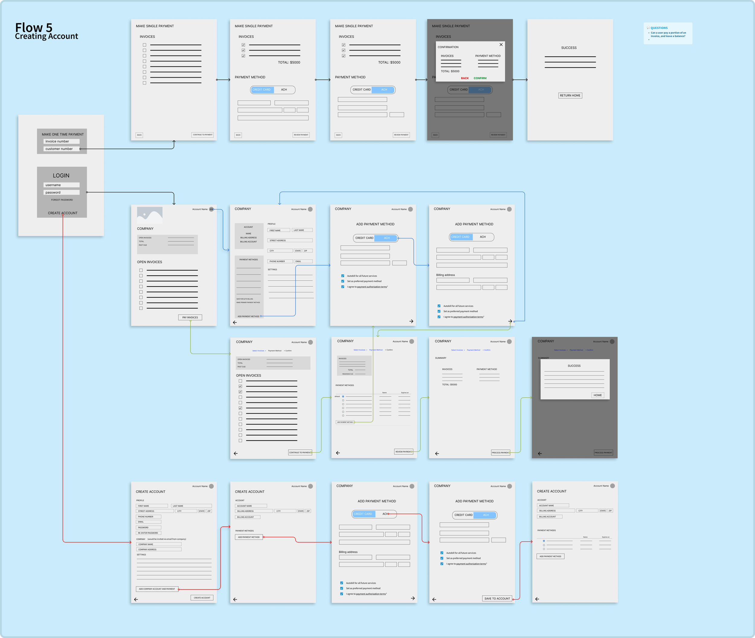
Low-fidelity work flows were created using the flow diagram as a guide. This phase of UX really interests me, I love riddles and problem solving, and there’s nothing like getting to the end of a string to ask the question “well why would we do that?”. I’m able to find ways to connect our flows and see where we can add value. While here we also begin picking out areas to explore for the project, such as creating an account, saving payment methods, seeing detailed reports on payment history, etc.
Low-Fidelity Mockups
I was able to use elements of our design system to make working low-fidelity mockups quickly, and with elements that will be consistent with high-fidelity/final design. The design system has been a great tool for speeding up design work, and allowing reusable, complex design elements to be used in a drag-and-drop style. Figma also released new prototyping variables, which drastically cut down the number of frames I had to create, while giving the user opportunity to use the prototype freely, with less guidance and dead-ends than ever before.

Gif showing the initial mock-up ready for user testing. In this screen, we asked users to sign in, select certain invoices, and pay them
User Tests
I ran several user tests, asking existing users of our product to navigate their way through the new payment portal. I had 3 tasks for each user to perform, and invited my colleagues to sit in, take notes, and give me feedback after it was done so I could improve my tests and become more comfortable running them. I had helpful notes on my figma screen, with prompts of things to say, things not to say, reminders to myself, etc. These virtual sticky notes helped keep all the tests consistent, professional, and yielded great data as the tests were done as fairly as possible. In the end, we learned a lot of valuable information, decided to tweak a few small things after gaining insight on how the users actually use our product, which was not what we expected.
Hi-fidelity design, Work Flows & Prototype updates

At this stage, we started finalizing the work flows with the developers, engineers, and financial department to build a shippable payment portal. Using our findings from the User Tests, and building out our pages with the new design system, I start finalizing designs, and creating prototypes to showcase the flow that users would go through when using the portal. This is my personal favourite part of the design path, prototyping flows and finally seeing our vision come to life. This image to the left shows several flows a user would go through using the portal, this helped adding frames that I originally missed, brought up issues we may run into, and ironed out some of the question marks we were still working out. There was a big emphasis on working prototypes, it was only possible with Figma’s updates to prototyping, cutting down the number of screens drastically, while increasing the capabilities.
Usability Testing
Usability testing was the next step, we have 80% high-fidelity designs, user testing results, prototypes of user scenarios, and eyes from engineers, developers, product owners, the finance department, and other designers. Usability testing will verify our designs, and give the green light to hand off our finished, high-fidelity designs. I put together a similar set of questions to ensure our users can effectively use the payment portal, and reached back out from our product managers to get volunteers. I don’t have any video of our usability testing, but I have the prototypes with arrows indicating where the user will target to successfully get through the tasks asked of them. An example is seen here.

At the end of our usability tests, we yielded extremely positive results, inspired confidence among our team, and allowed final design edits before handing it off to development. Several things still remained to be determined, such as how much we can edit the credit card input modal, as we use a third party software for storing secure information, and the depth of some of the secondary features such as payment history.
Impact
As this is a recent addition to our product, we haven’t been able to track our results. However, we are in the process of tracking KPI’s to see how well it’s performing. Some of the metrics include: Number of ACH payments made, percentage of WinTeam customers using the integration, total number of transactions being processed, and percentage of total EFT transactions being processed via the portal. We’ve received very positive feedback from our customers who had early access to the portal, and are excited to see it distributed to all our users.