
DESIGN SYSTEM
This project was a large undertaking, but lots of fun and I learned a lot. I wanted to create a design system from scratch, so I started with the idea for travel application called “Jetsetter”, and created the material system components in Figma.
Project Overview
A design system is a collection of reusable components, guided by clear standards, that can be assembled together to build any number of applications, accessible for all users on various platforms. They need to go hand in hand with the need for scale, efficiency, and consistency in design. They basically straighten out what could be a mess of imperfections. I created the Jetsetter Design System, spending more time than I’d like to admit, creating text styles, elevations, color styles, icons, navigation, banners, cards, chips, dialogs, and so on. However a good design system is much more than just a component library, and if built correctly, it is the vital spark of your products. Take a look at what I put together below.

Responsive Grid Layout
You don’t build a house in a day, it requires a strong foundation, a lot of planning, and if done well, the entire house looks seamless. The same thing applies to design systems. The foundation of a design system is the spacing and grid system. Following suggestions from various resources, I went with an 8pt grid system, and created a series of column grids for a 4, 8, and 12 column system, that encompasses devices sizes from small mobile, tablet, to computer. I kept everything divisible by 4, meaning the small devices would have margins & gutters of 16px, and 4 columns, all the way up to the large screens with margins & gutters of 24px, and 12 columns, with everything scaled in between. The idea is to use uniform elements and spacing in a design system to encourage consistency across platforms, environments, and screen sizes. The reason why I went with an 8pt system is to help the design system be more responsive because all of the top screen sizes are divisible by 8 on at-least one axis. This is important as it will help prevent anti-aliasing.

A Responsive Grid System, and my reference for grid spacing from Material.io’s online resource.
Text Styles
For web I wanted to go with a clean and versatile font for this system. I chose Source Sans Pro because the geometric shape of the letters and the spacing between characters is perfect. It’s also versatile with several variations in weight, giving pleasing options all the way from headers to small buttons. For mobile devices I went native using San Francisco for iOS and Roboto for Android.
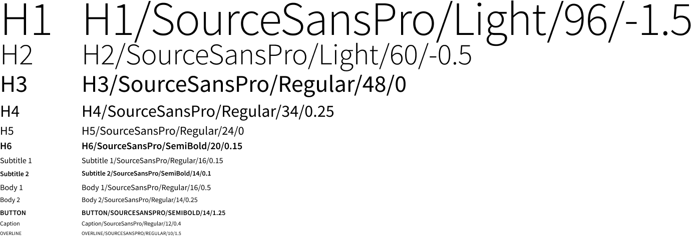
Font Styles for Jetsetter, above is Source Sans Pro, showing the weight, size, and letter spacing
Elevations
Elevation is the relative distance between two surfaces along the z-axis, or it’s how you’d perceive elements that are on top of other elements, in 2 dimensions. On a screen, we show depth along the z-axis by shadows, or color contrast. Surfaces at different elevations do the following: Allow surfaces to move in front of and behind other surfaces, such as content scrolling behind app bars, reflect spatial relationships, such as how a floating action button’s shadow indicates it is separate from a card collection, and lastly focus attention on the highest elevation, such as a dialog temporarily appearing in front of other surfaces. The distance from the front of one material surface to the front of another is measured along the z-axis in density-independent pixels (dps) and depicted using shadows as seen below. This allows team members in Figma to quickly select a frame, click effect, and the library of dps becomes selectable. Below I also included reference material from Material.io’s site on elevations that helped me create the library.

Sample Elevations on the left for use in Figma, then references for elevation depth in applications in center and right
Iconography
For any application, icons help the user as visual aids to complete certain tasks. Simple, clean and familiar icons get that job done faster and with better clarity, which is why for Jetsetter I opted to go with the feather icon library. The feather icons all have a 24px grid, 2px stroke, and are simple and clear for the user. This decreases confusion that can come with complex icons, or icons that are hard to read on smaller screens. Below is a sample of icons from the feather icon library.

Several of icons from the Feather Library
Color System
Color themes are designed to be harmonious, ensure accessible text, and distinguish UI elements and surfaces from one another. Color supports the purpose of the content, communicating things like hierarchy of information, interactive states, and the difference between distinct elements. They should also look good and be pleasing to the eye, but that’s not their critical function. It’s easy to neglect accessibility, and not meet WCAG (Web Content Accessibility Guidelines) standards. For Jetsetter, I chose primary, secondary, and access colors, as well as error, warning, and success colors to give function to their look. I also incorporated grayscale styles for text legibility and delineating importance.

Color system for Jetsetter
Buttons
Buttons allow users to take actions, and make choices, with a single tap. I know, earth shattering information, but buttons are more than just a thing you click on. They have various states, from enabled, hovered, focus, selected, activated, pressed and dragged. I kept the design for these buttons simple, including contained buttons, buttons with icon, outlined, and just plain text. You can see some iterations of my buttons on the left below, and their backgrounds/states on the right.

Button styles on the left, and their color/contrast in various states on the right.
App Bars (Top & Bottom)
Since Jetsetter is an app that can be used on mobile phone, app bars are going to be required. App bottom bars have three main principals, they need to be actionable, flexible, and ergonomic. Bottom app bars highlight important screen actions and raise awareness of the floating action button, while being easy to reach for the user at the bottom of the screen, and changing with needs of the varying screen sizes. Applications with a bottom navigation bars don’t require bottom bars. Similarly, app top bars have three main principals, they need to be persistent, guiding, and consistent. Top app bars appear at the top of each screen in an app, and can disappear upon scroll. They have consistent placement to build familiarity, and help reliably guide a user through the application. Below are design styles for my top and bottom bars.

Iterations of app bars to be used on Mobile
Banners
A banner displays a prominent message and related optional actions. It displays an important, brief message, and provides actions for users to address, or dismiss. Banners typically appear at the top of the screen, below a top app bar. They’re persistent and non-modal, allowing the user to either ignore them or interact with them at any time. Banners often remain on the screen until the user dismisses the message, or if the state that caused the banner to appear, gets resolved. below are templates for banners for Jetsetter.

Banner templates for mobile, and desktop
Dialogs
Similar to banners, dialogs inform users about a task that requires attention. However, unlike buttons, they can contain critical information, require decisions, or involve multiple tasks. A dialog is a type of modal window that appears in front of app content to provide critical information or ask for a decision. Dialogs disable all app functionality when they appear, and remain on screen until confirmed, dismissed, or a required action has been taken. Below are examples of dialogs I created for the app.

Six dialogs to be used on mobile, and one for desktop computer.
Date Picker
Date pickers are used to select a date, range of dates, and complete many fields in a travel app. These date pickers appear as dialogs on mobile, and text field drop downs on desktop. Date pickers have three main principals, they need to be relevant, clear, and intuitive to use. Below are examples of date pickers created for Jetsetter, including mobile variations, and one desktop. You can also see the mobile range picker showing a “dark” theme, showing a more bold visual moment using the color styles chosen for the app. Just having fun with it.

Date picker/Calendar layouts for mobile.
Cards
Cards are surfaces that display content and actions on a single topic. They should be easy to scan for relevant and actionable information. Elements, like text and images, should be placed on them in a way that clearly indicates hierarchy. Cards always felt broad to me, like there were so many possibilities of a cards function, look, and execution. Below are some standard cards with placeholder text and images.

Card examples for Jetsetter.
In conclusion…
Creating a design system was a complex task, that not only taught me a lot about design principals, but also taught me a lot about the in’s & out’s of Figma. Even the little I showed is only a slice of what goes into a comprehensive design system, I haven’t even broken into visual language, brand guidelines, css framework, pattern libraries, and so much more. If I was to take Jetsetter further and create a working app, I feel confident with my starting point because of this design system.
Below are just some of the resources I used to learn about design systems, creating them in Figma.
This post on UX Collective
Teachings from: Atomic Design Book, by Brad Frost